Category and series
A panel’s Category and Series settings determine which data are displayed on the chart, and how they are presented.
A chart is a graphical representation of a set of data in ways that convey information accurately and efficiently. A chart can have many forms, however, there are common features found in charts that allow humans to quickly extract necessary information.
Besides the succinct description of the chart title, data are displayed on the chart’s axes. The x-axis is the horizontal axis (abscissa), and the y-axis is the vertical axis (ordinate). There are scales on each axis to denote periodic graduation of numerical or categorical data. Each axis represents one data type to be plotted. Data plotted on the x-axis are typically independent variables, and the data on the y-axis are dependent variables.
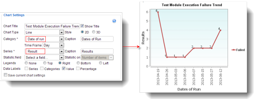
The x-axis and y-axis on the Dashboard charts are determined by the Category and Series, respectively, in the chart settings. It is advisable to always assign the Category to independent (manipulated) variables and Series to dependent (responding) variables. Each graduation on the x-axis represents a group of tests having similar results, and each graduation on the y-axis represents a numerical count for each group of test results defined on the x-axis. For example, if you want to graph the results (passed, failed, warnings, etc.) of test module executions for a range of execution dates, select Date of run as the Category and the Result as the Series. The picture below is a line chart created from such selection. The y-axis indicates the number of failed tests for each date of test runs.
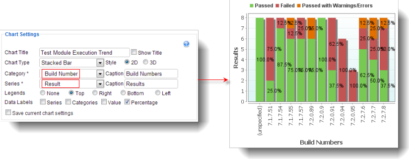
Which category to choose for the chart settings depends on how you want to best present the test result data on the chart. Generally, you should select a category that stands alone and is not affected by other variables which you are trying to measure. Time lines, priorities, assigned users, and build numbers are examples of categories. The stacked bar chart below displays the test results of various project builds; within each bar (representing a given build), the relative numbers of each result type are presented as a percentage of the total for that build.
For series, you should select the variable which you want to quantify for each value in the category. TestArchitect searches all applicable test results for each item in the category and tallies up the number of items found matching the values specified in the series. In the stacked chart above, for example, TestArchitect searches and counts all applicable test results for build numbers (category) denoted on the x-axis having the same results as defined by the series. Specifically, the number of test results that passed, failed, passed with warnings/errors are counted for each build number on the x-axis. The results of the counts are shown on the y-axis.
Related concepts
