Heat map settings
A heat map panel displays user-selectable data in a graphical tabular format where data meeting certain criteria that occur in a consecutive manner are noted and highlighted for quick viewing.
A Dashboard heat map is a graphical representation of data in a two-dimensional tabular chart with user-defined color ranges. The heat map is used to spotlight data trends and occurrence frequencies, and especially consecutive repetitions.
The column and row data on the graphical heat map are set from the Category and Series settings respectively.
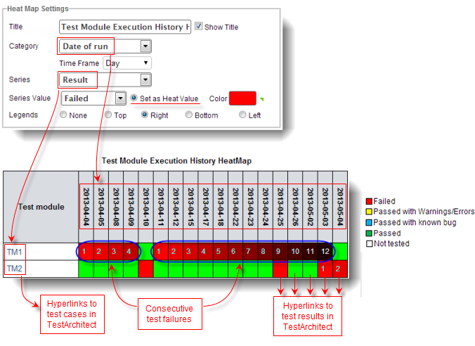
In the heat map settings below, Date of run is selected as the Category and the values are accordingly arranged in columns in the heat map. The Result of the test module execution is selected as the Series in the heat map settings and arranged as rows on the graphical heat map. You can set the color to represent each series value on the heat map. In the heat map example below, red cells represent failed test modules, and green cells represent passed test modules.
Notice the Set as Heat Value radio button is selected for the Failed Series Value, which is colored as red cells on the heat map. For two or more consecutive Series that result in a value defined in Series Value (Failed), the color of the corresponding cells darken slightly and the label numbers on those cells increment by one. Also, the cell color turns black after the twelfth consecutive recurrence of the Series Value. The color of the heat map cell returns to the original non-darkened color after a non-consecutive (non-repeating) Series Value. For example, in the heat map above, there are four consecutive test module TM1 execution failures dated from 2013-04-04 to 2013-04-09, and twelve consecutive failures from 2013-04-11 to 2013-05-03. The cell color of each consecutive failure darkens slightly (darker red). TM1’s execution passes on 2013-04-10 (green cell) and fails again on 2013-04-11. Since the execution result is a non-consecutive fail-pass-fail (from 2013-04-09 to 2013-04-11), the cell color returns to the originally specified red and the cell label number is reset back to one (on 2013-04-11) for the next consecutive set of test module failures.
Each row label in the heat map is a hyperlink to the corresponding entity in TestArchitect. For example, if you click on the TM1 field on the above heat map, TestArchitect opens and loads test module TM1 automatically for viewing. Each cell in the above heat map is a hyperlink to the test result corresponding to that cell. For instance, clicking on the heat map cell for test module TM2 that failed on 2013-05-04 opens TestArchitect and loads the detailed results report for that test run.
Creating a heat map panel
Use a heat map panel to show data as cells in graphical tabular format where consecutive recurrence data are emphasized using cell color variations.
Editing a heat map panel
Modifying a heat map’s appearance and/or the data used to generate it.
Related information
Category and series
Heat map settings
Report settings
Indicator settings
Chart settings
