check toolbar button state
Description
Check the state of a button on a toolbar against an expected state. Result is Passed ifthe values match; otherwise Failed.
Arguments
window
TA name of the window.
toolbar
TA name of the toolbar control.
button
Button, as identified by its captionor index value.
expected
Expected state.
Allowable values:
-1 or disabled
Button is disabled.
1 or enabled
Button is enabled but not pressed.
2
Button is enabled and selected (on), or enabled and pressed
pressed
Button is enabled and pressed.
checked
Button is enabled and selected (on).
Valid contexts
This action may be used within the following project items: test modules and user-defined actions.
Notes
- button argument:
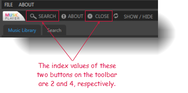
- The buttonmay be specified by either of two means:the caption text, or its numerical index. (Indexes are one-based; that is, numbering begins at 1.)
- Enclose a numerical text string in quotation marks to differentiate it from a numerical index value. For example, if a text value of an item in a control has a value of 12, you should reference that item by passing 12 surrounded by quotation marks (that is, “12”) instead of the numerical 12. Passing the numerical 12 is treated as a reference to an item with an index of 12, rather than an item holding a text string value of 12.
- This action supports the <ignore> modifier. If the string
<ignore>is present as the value of any of the arguments, or any argument contains an expression that evaluates to<ignore>, the action is skipped during execution.
Applicable Built-In Settings
The following settings are applicable to this action: case sensitive, remove double quotes from cells, standard ASCII only, object wait, value changed wait, window wait, load invisible controls.
Applicable Controls
This action is applicable to the following controls: toolbar.
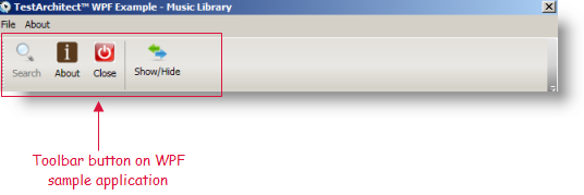
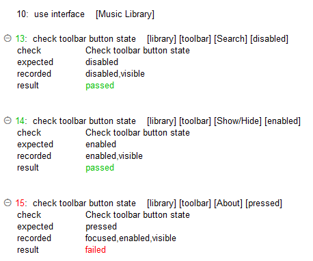
Example - Case 1: Using a text value for button

Action Lines
Result
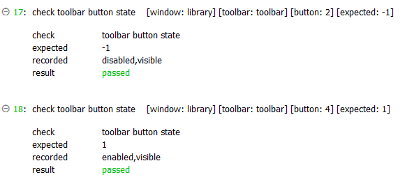
Example - Case 2: Using a numerical index value for button

Action Lines
Result
Related information
