Creating a heat map
In this activity, you will create a heat map, which is a matrix in which the color, or shade, of each cell is used to represent a certain quantitative and/or qualitative value.
Before proceeding:
- Ensure that you have a basic understanding of the TestArchitect Dashboard before creating a chart panel.
- A Dashboard portal, connected to the Sample Repository, should be open in your browser.
A heat map uses color and shading to help visualize an extra dimension on a chart or other graphic. In this exercise you will create a heat map that can be useful in alerting a test manager of a potential problem - the continuous failure of a given test module.
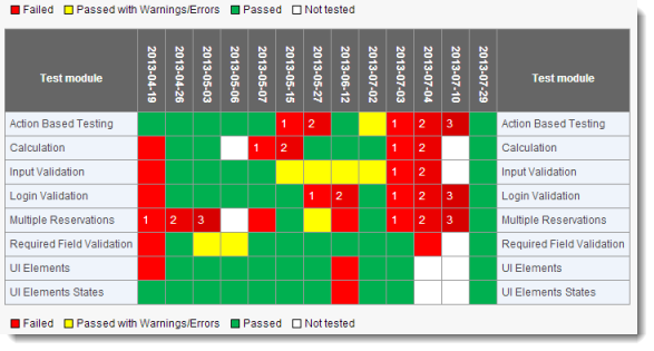
The heat map consists of a matrix with each unique test module placed along the vertical (y) axis, and with time along the horizontal (x) axis. The heat map tracks various test modules for a given AUT over the y-axis, with time ascending along the x-axis. Hence each cell represents a test performed at a given time, and is color-coded to indicate one of the three possible result outcomes. But a cell can be more than just red, yellow or green: contiguous Failed cells along a given row are colored in darker shades of red as they go from left to right. Hence, with a quick glance at the chart, the presence of any dark red cells alerts a test manager to the fact that one of more test modules have been failing continuously.
Create a new data profile with the folowing settings:
- General Settings screen
- Name:
Test Modules with Results - Item Type:
Test Module - Related Data:
Related Test Result - Distinct check box:
selected
- Name:
- Display Fields screen
- Name:
selected
- Name:
- Display Sub-Fields screen; select the following:
- Name
- Build Number
- Date of run
- Result
- General Settings screen
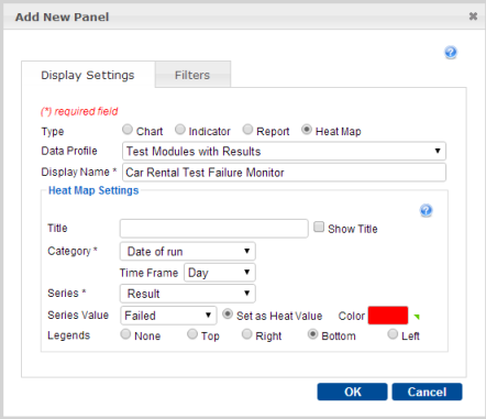
Create a new Dashboard panel with the following settings:
- Type:
Heat Map - Data Profile:
Test Modules with Results - Display Name:
Car Rental Test Failure Monitor - Category:
Date of run(under Related Test Results) - Time Frame:
Day - Series:
Result(under Related Test Results) - Series Value: Set colors for each of the possible values as follows:
Passed:greenPassed with Warnings/Errors:yellowFailed:redAdditionally, select Set as Heat Value for theFailedsetting of Series Value.
From the Global Setting icon
 of the Dashboard’s tool bar, select Create Panel.
In the Add New Panel dialog, enter the values as specified above, and click OK.

In the Panel Configuration dialog, select the following, then click OK:
- Select page:
Tutorial Page - Height:
400 - Folder:
Car Rental/Tests
- Select page:
- Type:
The resulting heat map is displayed.

Observe that all Passed results are a single shade of green, all Passed with Warnings/Errors a single shade of yellow. But Failed results are various shades of red, as Failed was selected as the heat value. Failures cells grow darker as time progresses, but only for consecutive Failed cells. Data labels indicating number of consecutive failures, but only to cells that are part of a consecutive failure trend.
What you have learned:
- Heat maps use color, or shades of color, to present an additional dimension of quantitative data.
- Heat maps are useful for monitoring failure trends.
- How to configure a Dashboard panel to present a heat map.